Why consistency matters in website design

Charli
Marketing Manager
Humans are creatures of habit – we prefer things we’re familiar with. 61% of consumers are more likely to purchase from a brand they recognise. And this recognition goes beyond fundamental brand awareness. Creating true recognition, familiarity and trust with your brand, particularly in the digital space, comes down to consistency.
When we talk about consistency, we’re talking about visual consistency, but also delivering a consistent experience.
In this blog post, we’ll look at:
- The importance of consistency in website and digital product design
- How you go about establishing visual and brand consistency in the digital space
- Some of the individual design and interactive elements you need to consider
Establishing visual consistency
Consistency goes beyond ensuring you’re using your brand’s logo, colours and fonts in a cohesive way. To create a truly consistent experience across your website and other platforms, it’s important to have a defined visual style that users can easily recognise and associate with you. As a user moves through your website and any other digital experiences connected to it and your brand, they should always feel confident and familiar that they are still interacting with you – and this should be visually clear.
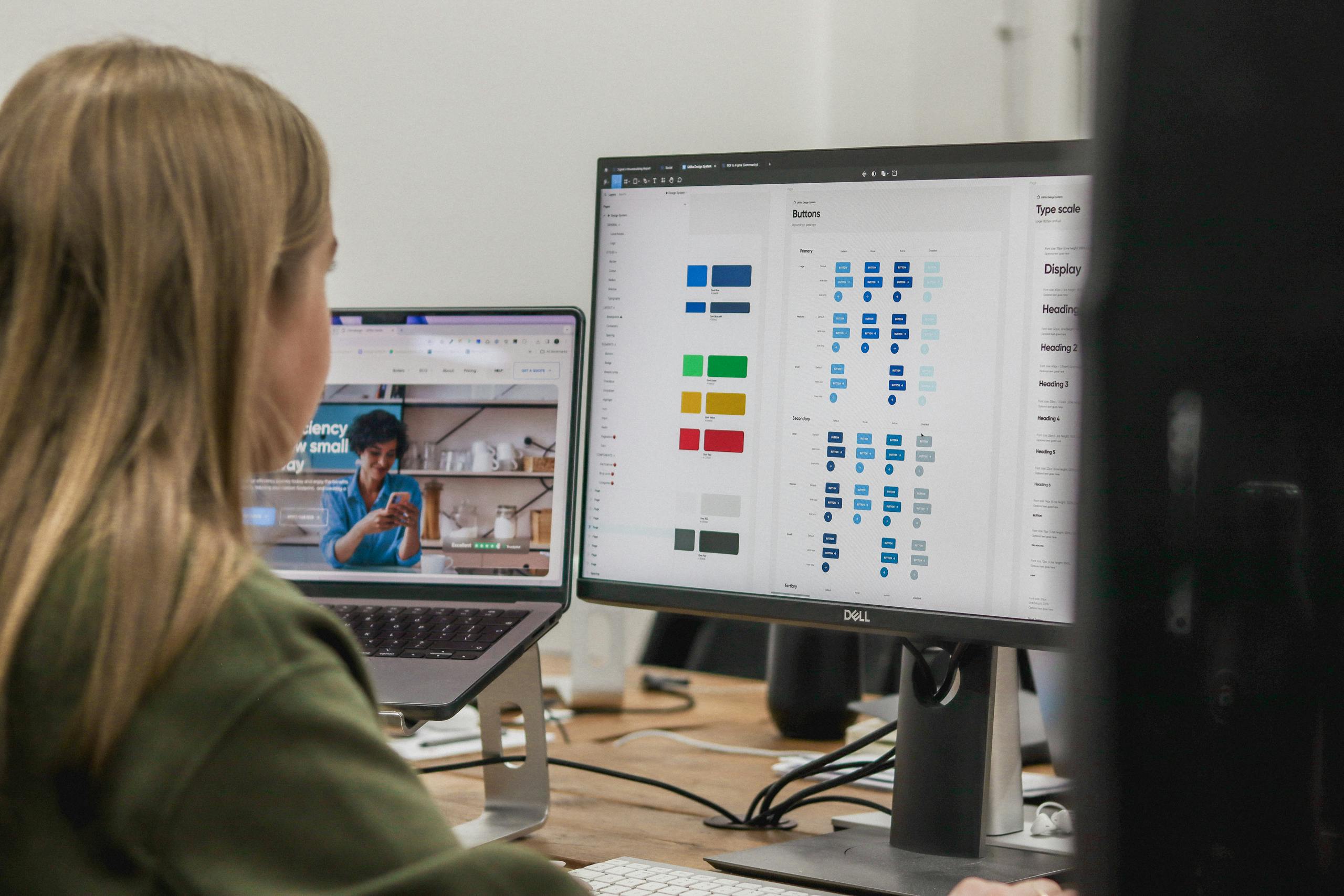
The best way to maintain this visual consistency across a website, multiple websites or digital products is to utilise a digital design system. When we’re embarking on website projects, this is our starting point and central source of truth for how a brand looks and feels in the digital space. This covers everything from colours and typography to buttons and hover states. This design system is then used to build a bank of components which clients can then use to build out pages and posts whilst maintaining a consistent style. Having this “locked down” approach means that we and the client can ensure that they still have the flexibility to manage their own content whilst protecting the visual integrity of their brand.
Maintaining brand consistency
Most brands have to effectively straddle a multitude of different touchpoints and experiences – both online and offline. Your brand will be seen and experienced everywhere from advertising campaigns to social media and from your website to apps. Ensuring that your brand carries across offline and digital channels is another important aspect of consistency in web design and wider brand identity.
Failing to consider digital
We’ve noticed a bit of a trend recently of large organisations doing major rebrands which have very transparently either failed to consider digital or approached it as a bit of an afterthought. This is sadly much more common than you might think, and it can really hurt the credibility of a big brand and seriously impact user experience.
In a recent example, we noted that the RSPCA had carried out a major overhaul of their brand – their first in over 50 years, actually. In doing so they had simply “reskinned” their existing website and applied all the new brand elements to that rather than redesigning or redeveloping. They’d largely done an OK job, but an area where it fell down was in the donations funnel (one of the most important aspects of their website) – where you can see in the screenshot below that the form input fields are stacked in such a way that makes it feel inaccessible, overly long and a bit clunky. That’s not to mention issues with colour contrast on certain text, pixelated low res imagery and clunky button styles. Hardly in keeping with their streamlined and bold visual identity.

Nailing colour and typography
Colour and typography are the building blocks of your visual identity. Having a recognisable colour increases brand awareness by 80%. Coincidentally, using a consistent font style also increases brand recognition by 80%. A big part of creating a consistent visual identity across online and offline channels is nailing how you use different colours and font styles. You’d be amazed at how many brand guidelines we receive when embarking on new projects which haven’t considered web fonts or how certain colour combinations will appear on a website or digital product and may impact legibility, accessibility and usability. Considering these elements carefully is key to providing a consistent and accessible experience across all digital platforms whilst maintaining your brand’s identity – it’s a tricky thing to balance.
Enhancing familiarity and trust
Think about how you might feel if you turned on your smart TV, loaded up say Netflix and it looked completely different to how it did on your phone. Not only would it make you question whether it was actually Netflix, but you might struggle to navigate around or find familiar or recognisable controls or buttons as you usually would. This experience would be pretty jarring and most likely detrimental to your impression of Netflix as a whole. Having a consistent look and feel and experience across not just your website but other digital products in your ecosystem helps to create familiarity and foster trust with your users. They know what they are getting from you and what to expect – and wherever they interact with you, there’ll be recognisable elements from your brand and digital identity that they can latch on to.
Key takeaways
- Visual consistency goes beyond using the right colours, fonts and logo, and needs to consider a whole range of design and interactive elements
- Failing to properly consider digital channels when you’re undertaking a wider rebranding project can be detrimental to the impact and impression of your brand overall
- Having consistency across your website and digital products helps to establish familiarity and foster trust with your users and customers
Need advice or guidance on how to establish and ensure consistency across your digital experiences and your wider brand? Get in touch and let’s talk about how we could help.
Related Posts