Our approach to navigation design and UX

Olly
Creative Director

Bad navigation is among the top reasons why visitors leave a website – and we all know from personal experience how frustrating it is to try and use a website with poor navigation.
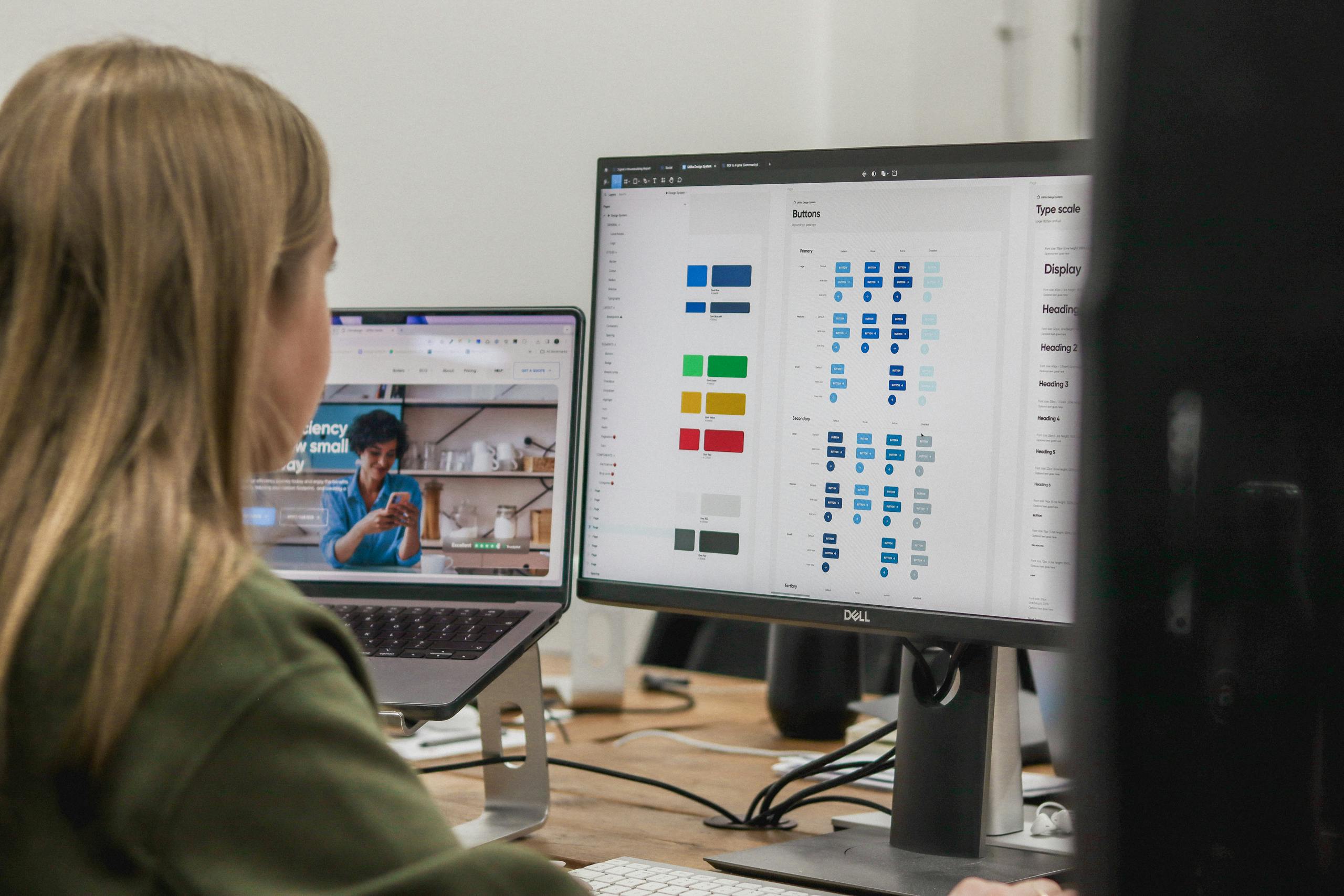
An intelligent approach to navigation is one of the building blocks of successful user experience (UX) design. Whether we’re working on a website with a relatively simple structure, or we’re challenged with presenting a great deal of complex information and content, careful consideration is required to design site navigation in a way that’s still easy and intuitive for users to interact with and move around.
In this post, we’ll share the key considerations behind our approach to navigation design, informed by core UX principles and ever-evolving trends.
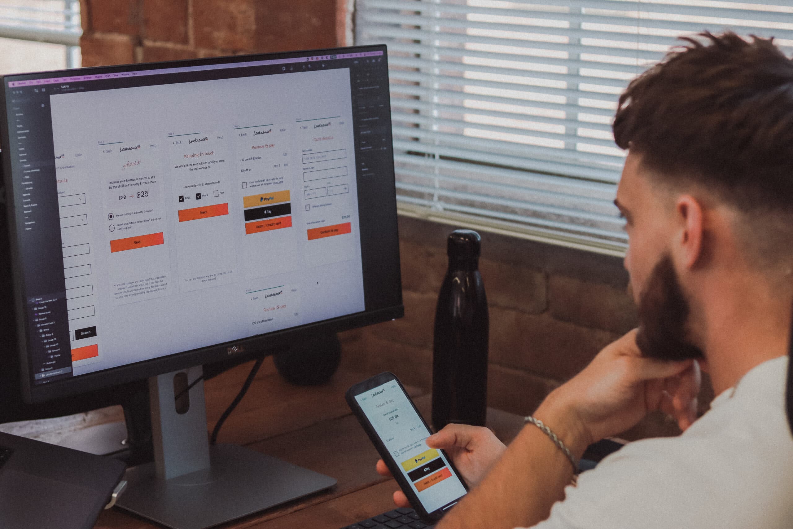
Mobile-first
Due to the proportion of the web’s traffic that comes from mobile, we take a mobile-first approach to design on most projects. Hidden mobile menus, with a burger icon or similar to access them, are the accepted norm now. But challenges arise when we need to display search, calls-to-action, phone numbers, language/region selectors, etc. It’s crucial that we think about how these options will be clearly communicated on mobile and then how that experience will scale up to larger devices.

The PHMG navigation positions key calls-to-action within comfortable reaching distance on mobile.
Keep it simple
The very first step in every single one of our website projects is to draw up an initial sitemap which details the key pages of the site and how they will be structured and grouped together. This goes on to directly inform how we’ll approach the navigation. Referencing Hick’s Law – minimising choices when response times are critical to decreasing decision time (i.e. ensuring the user can find what they need to in as little time as possible before they lose interest and leave) – we make use of sub-pages and drop-downs to structure related pages. This gives users fewer menu links to take in and enables them to find the content they need and make choices quickly.

The Spitfire Homes navigation removes distraction by only displaying key link in the menu, featuring a hidden menu for the remaining pages.
Be Obvious
It can be tempting to “deviate from the norm” when it comes to navigation – overcomplicating terminology or trying to be “too clever” with how things are structured. But we find it’s important to simplify and be as obvious as possible. Think about what it is users are looking for and use appropriate link labels that are relevant and familiar. And don’t just make assumptions – test and validate different approaches with actual users and adopt the most successful one.
Consider interactivity
Just as thinking about the navigation experience on mobile devices is vital – there’s still a place for desktop. As such, it’s important to consider how you’ll communicate that menu items and buttons are clickable and interactive on non-touch devices. We can do this through using clear hover states (i.e. a visual effect, element or animation that indicates your cursor is on an interactive element) to make sure links look and feel clickable.

Datatonic’s navigation uses a blue line on hover to clearly highlight which menu and sub-menu item are active.
Ensure accessibility
Accessibility is a vital consideration and component of digital projects – and accessible navigation is a key element of this. From a design perspective, this entails ensuring things like text size and contrast levels (i.e. sufficient contrast between the background and text/link colours) are compliant with relevant standards. Other considerations also include how the navigation will support functionality for users with various input devices – i.e. not just a mouse.
Utilise icons
Icons can improve navigation UX by providing a stronger visual reference than text alone – especially on devices with smaller screens. Frequently used icons like search, menu and phone are instantly recognisable and easy to find at a glance. As an added bonus, they take up less space than text-based links, so can be handy when you need to communicate information or include vital links on mobile devices or anywhere space is at a premium.
Key takeaways
Our approach to navigation UX is all about combining simplicity, familiarity and intuitiveness. Key considerations behind navigation design include:
- Using sub-pages and drop-downs to group together related content and present the user with less choices
- Being as obvious as possible with buttons and link text – think about what the user will be looking for and make it easy for them
- Thinking about building the simplest mobile experience and how you’ll incorporate things like search, CTAs and language selectors
- Incorporating interactivity and visual indicators to clearly communicate to users on non-touch devices that an element is clickable
- Ensuring navigation complies with accessibility standards
- Utilising icons to enhance/replace text links to create stronger visual references
Looking to start a website project and need an expert approach to navigation UX design? Get in touch and find out how we could help.
Related Posts