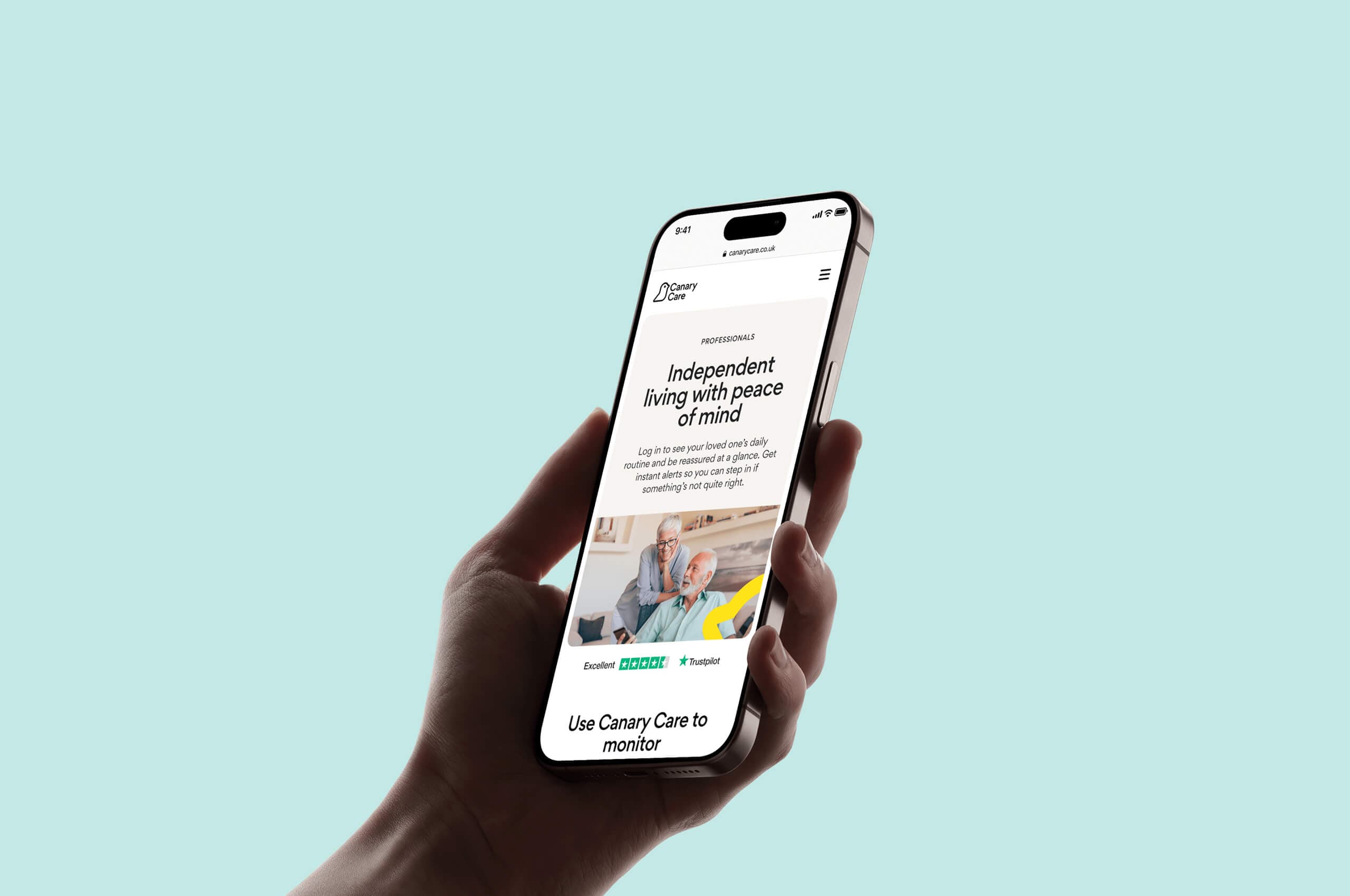
What does a good website conversion funnel look like?

Charli
Marketing Manager

A website conversion funnel is a path or process which guides users to complete a desired action on your website – that could be a purchase, enquiry, donation, booking an appointment, etc. Usually when we refer to a funnel, we’re talking about a “closed” process – so once a user enters, they’re guided through specific steps until they reach the end. It’s useful to think about key user journeys in this way as you’re able to carefully map out the flow from start to finish, keeping the process streamlined and simple and increasing the likelihood of a conversion at the end.
The average conversion rate for a website is less than 4% – but using all of the tools and techniques around funnels, you can ensure you’re maximising the number of conversions.
Website conversion funnel best practice
The exact flow and stages your website conversion funnel takes your users will vary depending on what action you want them to take. But there are a few areas where you can refer to best practice to build a successful funnel. Here are some best practices you can follow to create an effective conversion funnel.
Clear user journey
By design, a funnel offers a fixed user journey with clear steps. The user can’t freely navigate around, they’re locked in to and progress to each stage by clicking “next”. But there are still things you can do to make sure they stay in the funnel and have a positive experience that leads to a conversion. Clearly showing their progress through the funnel by displaying which step they’re on, or using something like a progress bar, will help them understand how long the process will take, setting their expectations upfront. You should also enable users to navigate in between stages of the funnel – able to go backwards and forwards to check or change information they’ve submitted.

The boiler quote funnel we designed for Utilita uses a simple progress bar at the top of the screen to visually indicate to the user how far through the process they are.
Simplified & streamlined
A key principle for website conversion funnels is keeping the amount you’re asking from the user to a minimum. Obviously, the point of a funnel will likely be to collect information in some form, but you want to a) rationalise the information you are collecting to a minimum and b) chunk it up into stages so it doesn’t feel too overwhelming.

In this simple two-step process to Book a valuation with Karl Tatler Estate Agents, the first stage only has 3 input fields to enter your address and the reason for the valuation, making it feel really quick and simple. You then enter your details on the next step.
There are also ways of presenting web forms so that it feels less cluttered and intimidating in terms of the information you’re being asked to input. Vertically stacking form fields makes forms feel longer, so making use of two columns to present your form fields makes it feel more compact.

On our studio site, the form is presented in two columns to make it feel less overwhelming and also to fit it on one screen to reduce the need for scrolling.
Utilise upselling techniques
As you’re guiding a user through a funnel towards whatever action you want them to complete, there are ways to find more value along the way.
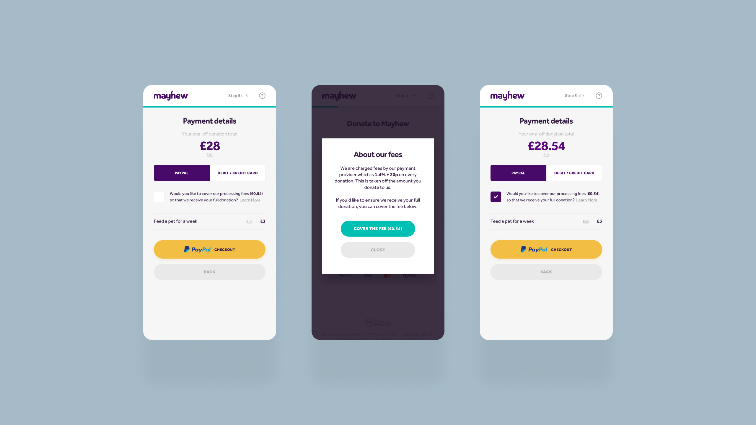
We used upselling to optimise the donations funnel for animal welfare charity Mayhew. Adding an upsell pop-up which encouraged users to add an additional contribution, such as donating an treat or enrichment toy led to a 7% revenue increase from donations. Encouraging users to pay for payment processing fees upped the total revenue from a donation, and 60% of users opted to pay cover those processing fees.
“Upselling” just doesn’t have to mean adding extras. In the charity space, there are things you can do to encourage more regular giving, which adds more value than a one-off donation. This can be as simple as defaulting the donations form to “monthly” rather than “one-off”.

At the start of Leukaemia UK’s donation funnel, “monthly” giving is selected by default, along with the optimal recurring giving amount.
Common website conversion funnel mistakes to avoid
Digital customer experience is as much about avoiding common pitfalls as it is about doing the “right things”. While the above areas of best practice can guide you in terms of some tools and techniques to create an optimised experience, you can learn just as much from examples where things aren’t quite right.
Repetitive or overcomplicated steps
As we’ve already touched on, probably the most fundamental principle of a good website conversion funnel is that it’s simple and streamlined. You don’t want to ask more of the user than is necessary or load too much into one step.
The main quote funnel for energy provider British Gas is a prime example of an overcomplicated process. The usual flow for a quote funnel for energy providers is Enter postcode >> Select fuel (gas, electricity, both) >> Indicate energy usage >> Get quote. British Gas requires you to go through 5 steps, clicking “continue” between each of them, only to be taken to a final screen where you have to input even more information, then confirm again everything you’ve already entered, before you can get a quote. This makes the whole process feel repetitive and drawn out for the user.

The British Gas quote funnel introduces more questions at the end of the funnel, and also repeats information you’ve already entered (the fuel type).
Poor experience on mobile
According to Google, more than half of web traffic comes from mobile. Depending on your business and your industry, the landscape and make up of traffic on desktop vs mobile might look different for you, but chances are some proportion of your traffic will come from mobile. Mobile-first design is the practice of prioritising user experience for smaller screens, stripping back to the most essential features. This isn’t the right approach for every project, especially if the majority of your traffic comes from desktop, but it is more and more common. Even if you’re not mobile-first, neglecting mobile experience for your conversion funnel could lead to a lot of missed opportunities. Again according to Google, users who have a negative experience on mobile are 62% less likely to make a future purchase.
Optimising your conversion funnel
You can follow best practice and avoid common pitfalls – but the reality is you won’t know how successful your conversion funnel is (or isn’t) until you’ve tested it in a live environment with real users. You can begin this process during the development phase by undertaking user acceptance testing, getting internal users and even a group of customers to test your funnel and identify any issues before it goes live. Once you have gone live, you should never consider that to be the finished product. Continuous testing, iteration and improvement will be key to ensuring you get the most value from your funnel.
Monitoring tools & analytics
You can use Google Analytics events to track conversions and identify drop-off rates at a high level. To get into even more detail by utilising a tool like Hotjar to review recordings of real user sessions and identify exactly where they’re getting frustrated, stuck or dropping off. Hot Jar also supports in-session user surveys so you can ask customers for feedback on the experience as soon as they’ve completed the funnel. Utilising data from these kinds of tools, you can continue to improve the experience to secure more conversions.
A/B testing
Through a combination of testing and monitoring, you might have a hypothesis that tweaking a certain aspect of your funnel will improve conversion rate. You can use tools like Optimizely to set up A/B testing – running two or more variations of your funnel in tandem to see which is more effective. You might test how different variables impact conversion rate like CTA text, button placement, different numbers of stages, etc. You can also choose how the different variations are displayed (i.e. 50/50, to certain users on certain devices, etc).
Incorporating AI & automation
How AI tools can benefit website conversion funnels could be a whole other post on its own. Whether it’s utilising personalisation and recommendations to improve upselling and experience or conversational AI to guide users through the funnel, it’s estimated that AI can help see a revenue uplift of up to 15%, and sales ROI of up to 20%.
Key takeaways
- A website conversion funnel is a guided path that leads users to complete a desired action on a website, such as making a purchase or submitting an enquiry.
- Following best practice, you should aim to have a conversion funnel that’s simplified, streamlined and takes advantage of upselling techniques.
- Don’t neglect the mobile experience for conversion funnels.
- Conduct testing and monitor the success of your funnels, prioritising ongoing improvement and iteration.
- Consider using AI tools to further boost conversion rates.
Looking to launch a new digital customer experience? Get in touch to chat about your project.
Related Posts