Mobile-first design: why it’s more important than ever

Charli
Marketing Manager

As of December 2022, over 62% of the web’s traffic comes from mobile devices. The ten-year trend on desktop vs mobile is pretty startling – in 2012, 94% of the web’s traffic came from desktop; mobile overtook desktop in 2017, and has been increasing its share ever since.
What is mobile-first design?
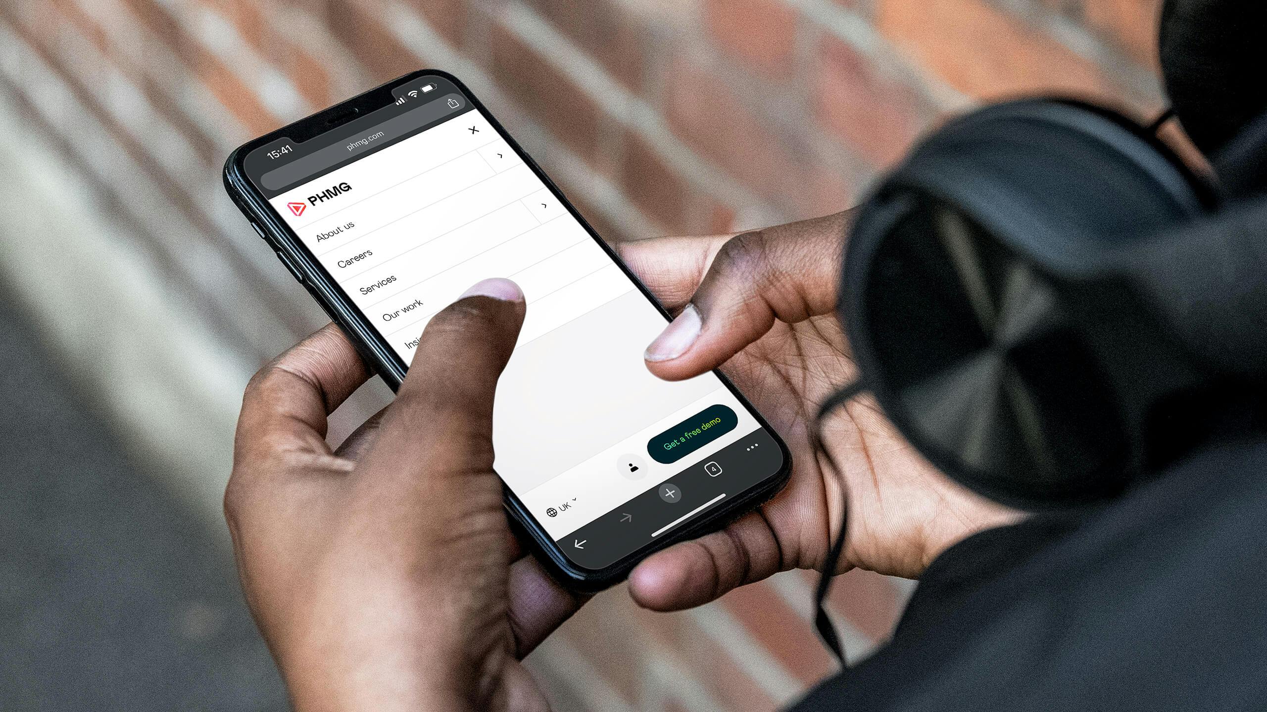
Mobile-first design is a strategy that prioritises the user experience on mobile and smaller screens. In mobile-first design philosophy, the idea is to start with core features and essential content – creating a streamlined experience, then scaling it up for larger screens (also known as “progressive enhancement”).
Mobile-first vs responsive design
Historically, you might have had two versions of your website – a desktop and a mobile version, with the mobile version either having its own separate HTML sitting either on the same domain or a subdomain, and being served dynamically when a user browses from mobile using a “user-agent” tag. This then evolved in to responsive design, wherein text, images and components would move and resize fluidly to fit various screen sizes.
Mobile-first moves beyond the principles of responsive design to make intentional design choices based on how people interact with content on mobile.
| Mobile-first design | Responsive design |
| Starts with mobile, then scales up | Starts with desktop, then scales down |
| Prioritises mobile UX and speed | Adapts desktop elements |
| Proactively designed in tandem with the desktop site | Reactive approach where the live website scales to fit different dimensions |
| Vital approach if the majority of your traffic comes from mobile | May be a better fit if the majority of your traffic comes from desktop |
Why mobile-first design is important
- Better user experience: focusing on key elements reduces the need to scroll or manually scale the page, as well as making interactions easier. Prioritising the mobile view ensures the best possible experience for users.
- Improved SEO rankings: mobile experience is a strong ranking factor for most search engines, particularly Google. Since 2018, Google has practiced mobile-first indexing, meaning it will predominantly use the mobile version of a site to index and rank it. As Google occupies 93% of the global search engine market, that’s a strong case for prioritising mobile.
- Faster load times: an optimised experience for mobile which is less cluttered and stripped back will lead to faster and more efficient loading, which is better for the user and is also a positive ranking factor.
- Stronger engagement: better mobile experience will lead to higher levels of engagement and increased likelihood for conversion and/or return visits.
Mobile-first design principles
While the broad focus of mobile-first is to prioritise the design and experience for smaller screens, more specific elements to focus on include:
- Content-first layout: stripping away elements that are unneccssary on mobile.
- Touch-friendly UI: optimised touch targets (i.e. large buttons/clickable areas), adequate spacing between interactive elements, visual feedback on interaction, design for one-handed use (considering “thumb reach”).
- Fast-loading assets: images, fonts and scripts optimised for fast and efficient loading.
- Progressive enhancement: bringing in more complex elements as the screen size scales up.
- Accessibility: ensure usability for all users, including assistive technologies – you can use a variety of tools to check your site’s accessibility compliance on mobile devices.
Should you always design mobile-first?
In most cases – yes. But there are exceptions. In some scenarios, it may be that the desktop experience warrants more focus, particularly if the majority of traffic comes from desktop – which is common in some B2B industries. Best practice is to be guided by the data – when embarking on a project with a client we carefully assess the traffic and engagement data and use that to make a call on the approach.

You can use the report dashboard under User > Tech in GA4 to check the percentage of traffic from different devices, as well as other detail like screen resolution.
Need some more guidance? We build all of our websites with a focus on high performance and world-class user experience, no matter the device. We can support you with reviewing your current site and advise of opportunities to improve and enhance your approach to your website and wider digital strategy – just get in touch and we’ll see how we can help.
Related Posts