Website Scalability & Flexibility: A Guide to Future-Proofing

Charli
Marketing Manager

Faced with a crowded marketplace, constantly evolving user demands, and rapid digital change, the ongoing success of your website or digital product hinges on two critical factors: scalability and flexibility. When working with all these factors, building a platform that can grow and adapt seamlessly is essential. Investing in these elements from the outset ensures that your digital experience remains robust and responsive, capable of handling increased traffic, integrating new features, and pivoting to meet changing needs without significant overhauls.
In this post, we’ll look at:
- What makes a website or digital product flexible?
- What makes a website or digital product scalable?
- Why are flexibility and scalability so important?
- Real-world strategies for future-proofing your platform
What is website flexibility?
Having flexibility in a website or digital product means being able to:
- Adapt seamlessly to changing circumstances – new technologies and trends, changes in your industry
- Respond to user expectations and incorporating user feedback – working in an agile way to incorporate feedback loops and provide the most possible value
- Add and roll-out new features or new digital experiences in your ecosystem quickly and easily – rather than making wholesale changes on a longer development cycle, you’re able to continuously iterate and improve
In summary, having a flexible digital platform enables continuous, iterative improvement and overall faster go-to-market with new features and functionality.
What is website scalability?
Going hand-in-hand with flexibility, having a scalable digital platform means being able to:
- Plan for increases and uplifts in traffic, API calls, data stored and processed, and users
- Support business growth – adding more versions (for example having a multi-site which targets different geographics and languages) and experiences seamlessly
- Support the storage and processing of larger volumes and different types of data
- Integrate seamlessly with more platforms and software across the organisation as needed
In short, scalability means that your website or digital product can grow easily as you do – without the need for costly rebuilds and massive overhauls further down the line.
Refactoring Tiviti to improve flexibility & scalability
We helped Tiviti launch a revolutionary offering in the telecoms industry by building and launching a connectivity-as-a-service platform that enabled customers to have complete visibility and control over their network in one convenient place. During our partnership with Tiviti, we identified the opportunity to refactor the codebase for their digital product in order to make deployments more efficient, as well as make future integrations and developments easier to implement.

Why do flexibility & scalability matter?
We’ve already covered some of the main benefits of focusing on creating a flexible and scalable website and/or digital product. So let’s dig a bit further into some more specific advantages of having those attributes on your radar when building and launching.
Future-proof
“Future-proofing” may sound like a bit of a buzzword, but it’s a really important consideration when it comes to your digital strategy. Developing and launching something which works specifically for your circumstances and needs in the here and now is fine – but it’ll be more costly to pivot to updates and improvements further down the line if you don’t bake scalability and flexibility in. As we’ve covered, there are two types of change you need to be prepared and future-proof for: technological change and market/business change.
- Technological change: uplifts in traffic or users, new versions of software you need to integrate with, different types or larger volumes of data you need to process, a new security threat you need to be aware of and prepared for.
- Market or business change: driven by you internally or by your wider industry, such as shifts in customer behaviour and new business models or propositions.
More cost-effective
Creating a foundation for your digital strategy that prioritises scalability and flexibility saves you investment in the mid to long-term. According to our research, organisations who opt for ongoing development and maintenance to their website/digital product rather than wholesale changes over longer periods can save up to 26% on development and support costs. It’s much more cost-effective to have your digital experiences and the underlying infrastructure grow effortlessly with you rather than having to build for where you are now and then repeat three years later.
How do you make a digital experience scalable & flexible?
As we’ve discussed, making a website or digital product scalable and flexible starts from the very beginning of the project. It’s much more efficient from a time and cost perspective to plan for growth from the start than having to rehaul everything later.
Go custom, not off-the-shelf
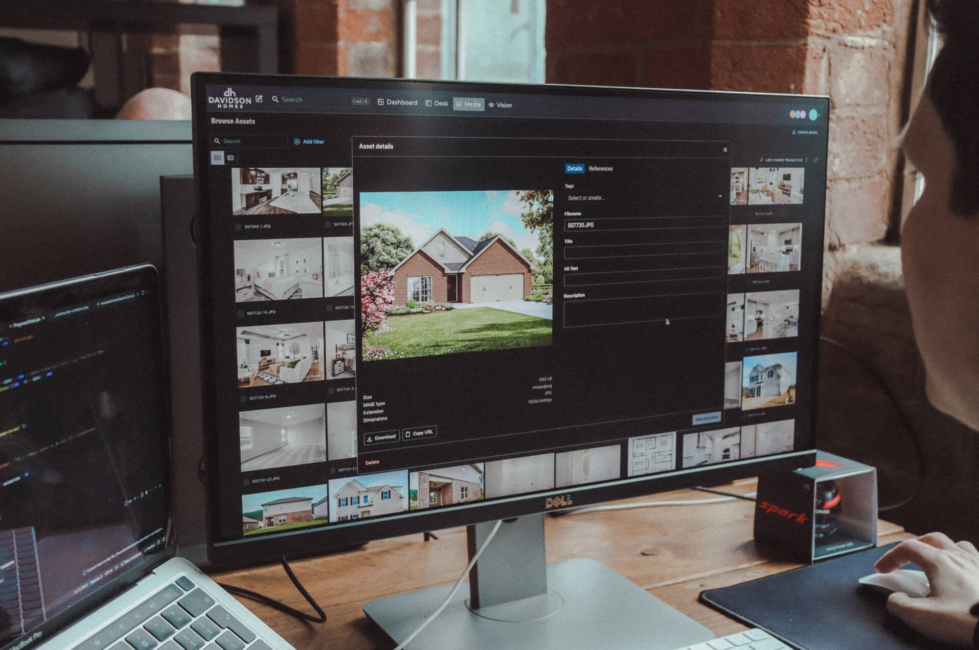
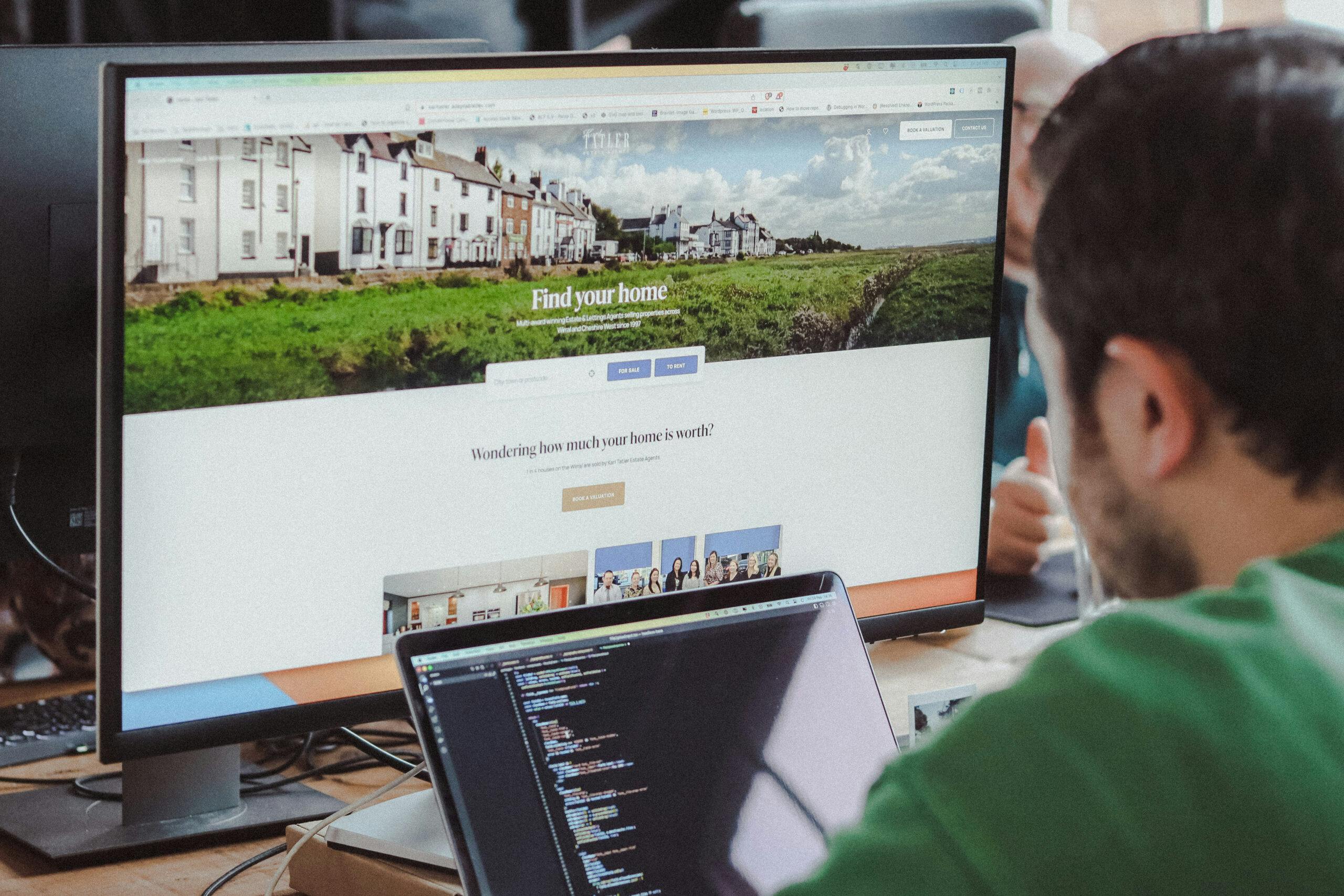
You’ll most likely find that there are a number of ready-made applications, platforms or website solutions designed for your particular problem and industry. But it can be difficult to achieve true flexibility and scalability with off-the-shelf solutions. Investing in a custom solution means that you have complete control over the codebase and the development roadmap, so new features can be added as and when you need them to be.
Choose the right infrastructure
Launching a website or digital product which will grow effortlessly starts with selecting the right tools and technologies to build on. Your digital partner will advise on the best tech stack to suit your needs from the outset – which will include everything from which content management system (CMS) is best to use to how everything should be set up and configured. A flexible, modern infrastructure allows for better performance and easier scaling.
If right for your particular project, harnessing technologies like headless – where the frontend (what the user sees) is separated from the backend (where the content is managed) – can also unlock more flexibility and scalability. Because of the separation, the frontend and backend can be managed and developed independently – enabling you to plug multiple frontends into the same backend system, and scale different parts of your ecosystem separately from each other.
Use a digital design system
A key part of building trust and authority with your audience is presenting a consistent visual identity. Lots of organisations have brand guidelines, but we have often find when we begin working with someone, this doesn’t extend to digital. A digital style guide is more commonly known as a digital design system – consisting of a set of reusable components/blocks and key properties like colours, font styles and sizes, button styles, and adjustments for screen sizes and responsiveness. Having a defined style guide for digital helps you to maintain visual consistency whilst speeding up deployment of new features and experiences.
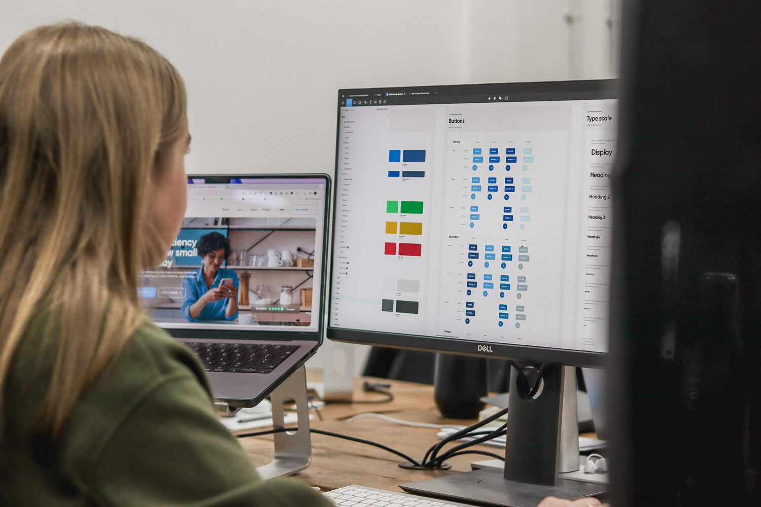
Having a digital design system in place speeds up the ongoing process between design and development – like in our project with Utilita Energy, where our digital design system enabled our engineers and their internal development team to effortlessly grab properties and code for each style and component to reuse in subsequent projects.
Secure ongoing support
Maintaining scalability and flexibility in your website or digital product extends beyond launch. Scalability and flexibility can be prioritised through an agile approach by separating development into feature-based chunks. This allows for more releases in a shorter timeframe and easier integration of user feedback. But agile doesn’t work for every project, and even if you haven’t got a programme of sprints planned, it’s still vital to the longevity of your website or digital product that you secure a framework for support, maintenance and continuous improvement. At the very least, having a support plan ensures all aspects of your website or digital product stay up and running and performing consistently.
Key takeaways
✅ Digital flexibility means your website or digital product can evolve seamlessly – from UX changes to feature rollouts.
✅ Scalability ensures your infrastructure grows effortlessly with your audience and data needs.
✅ The right approach includes:
-
- Custom development over off-the-shelf solutions
- Scalable tech stack and infrastructure
- Digital design system with reusable components
- A plan for continuous development and improvement
Need help building and launching a scalable and flexible website or digital product? Get in touch and let’s chat about your project.
Related Posts