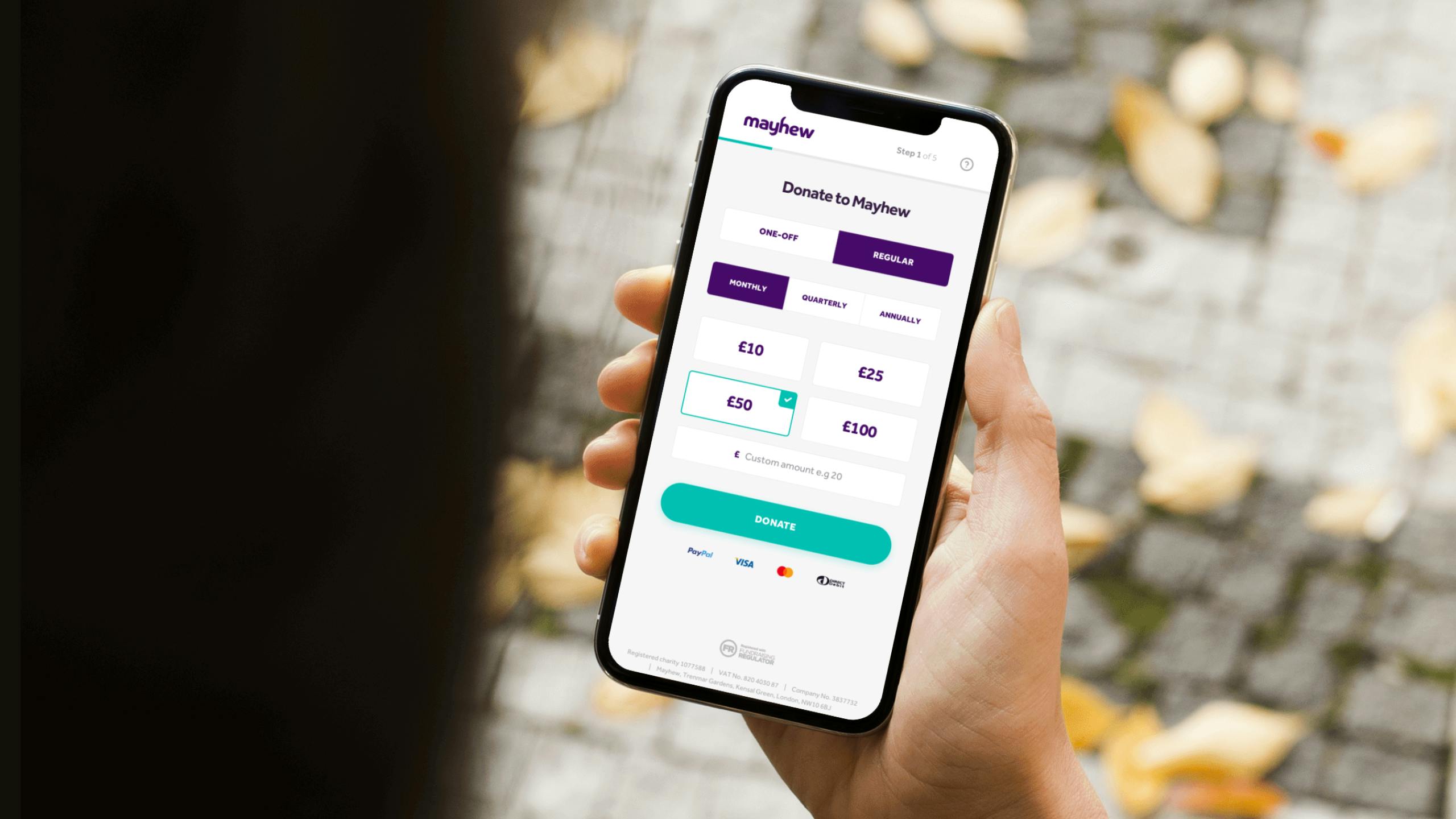
Firstly, we needed to map out the journeys for the multiple donation processes. Our aim was to create a single funnel with as few simple steps, presenting only the essential form fields so the donor didn’t feel like they had to undertake a large task.
To aid this, we introduced functionality such as automatic address lookup and streamlined data protection messaging. Due to the build approach we took, users could access every stage of the donations funnel without the need for the page to reload, making the process quicker.


