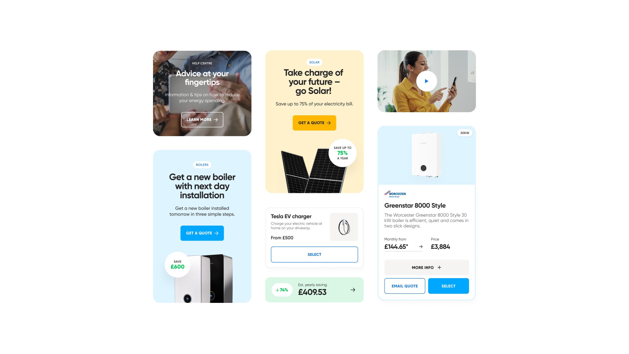
After beginning work with Utilita Energy on a number of projects across their product and service range, we collectively identified the need to put a “master” design system in place. This would enable both us and them to quickly and efficiently roll out visually consistent digital experiences across their range of offerings and sub-brands.
Utilita Energy
A design system that powers brand consistency

Overview
Utilita Energy is a brand UK consumers see every day. Whether it’s their 830,000+ customers who interact with their app, or people attending football matches or concerts at sponsored venues, the brand is everywhere. It’s vital that this brand is synonymous with trust, and building that trust begins with ensuring visual consistency across every channel.
Deliverables
Design system
Style guide
Component design
Creating a foundation for consistency

The starting point
We started by completing an audit of existing components and styles across the current main Utilita website, as well as those we’d created in our other projects for Utilita. We then created a list of components that needed to be designed or updated in order to bring everything inline and maintain consistency across the multiple experiences. This included 24 new components and updating 12 existing components for the main Utilita Energy website in its first iteration.

Establishing a master design system not only ensures visual consistency across digital experiences, but also makes the design and development process more efficient across multiple projects.

Bringing it all together
Our designers created a master style guide, within Figma, encompassing the components we’d created, allowing for responsiveness, variants and outlining key properties. The style guide documents and presents global styles across colour, typography, buttons and other visual elements, creating one source of truth for Utilita’s digital visual identity. It also establishes a consistent naming convention so components can be easily and quickly identified and utilised by us or Utilita’s internal engineering team.


Figma’s Dev mode enables Utilita’s development team to quickly grab properties and associated code for each style and component.
Working efficiently
The design system project was delivered as a sprint alongside our other Utilita projects to enable Utilita to accelerate internal work and our work on other sites and products to continue uninterrupted. Not only does this project lay the groundwork and establish consistency for other projects, it also helps us work more efficiently as we have a master style guide to refer to and design with reusable components..


“After seeing the quality of Adaptable’s design work on our other projects, it seemed like a no-brainer to get them on-board with creating a robust design system that we’d be needing to put in place for a while, but hadn’t had the time internally.”

Nic Rhodes


