How do you show that your organisation is innovative through digital?

Charli
Marketing Manager

As your organisation grows and evolves, without continuous improvement and iteration, it’s easy for your website and other digital experiences to get left behind. If focus shifts to other areas, you may review a few years down the line and find that they no longer reflect who you are as a business and what you offer.
Not only will an outdated website experience not do your organisation any favours in terms of appearing innovative, it could also damage trust in your brand. 94% of people don’t trust outdated websites – so if your experience is significantly lagging behind, this could really work against you.
Clearly, to stand out amongst your competitors and position yourself as a leader in your market, you have to go beyond just keeping your digital experiences “up-to-date”. How do you use your website and digital experiences to showcase your organisation’s innovation and place yourself at the cutting edge in your industry?
Going beyond the superficial
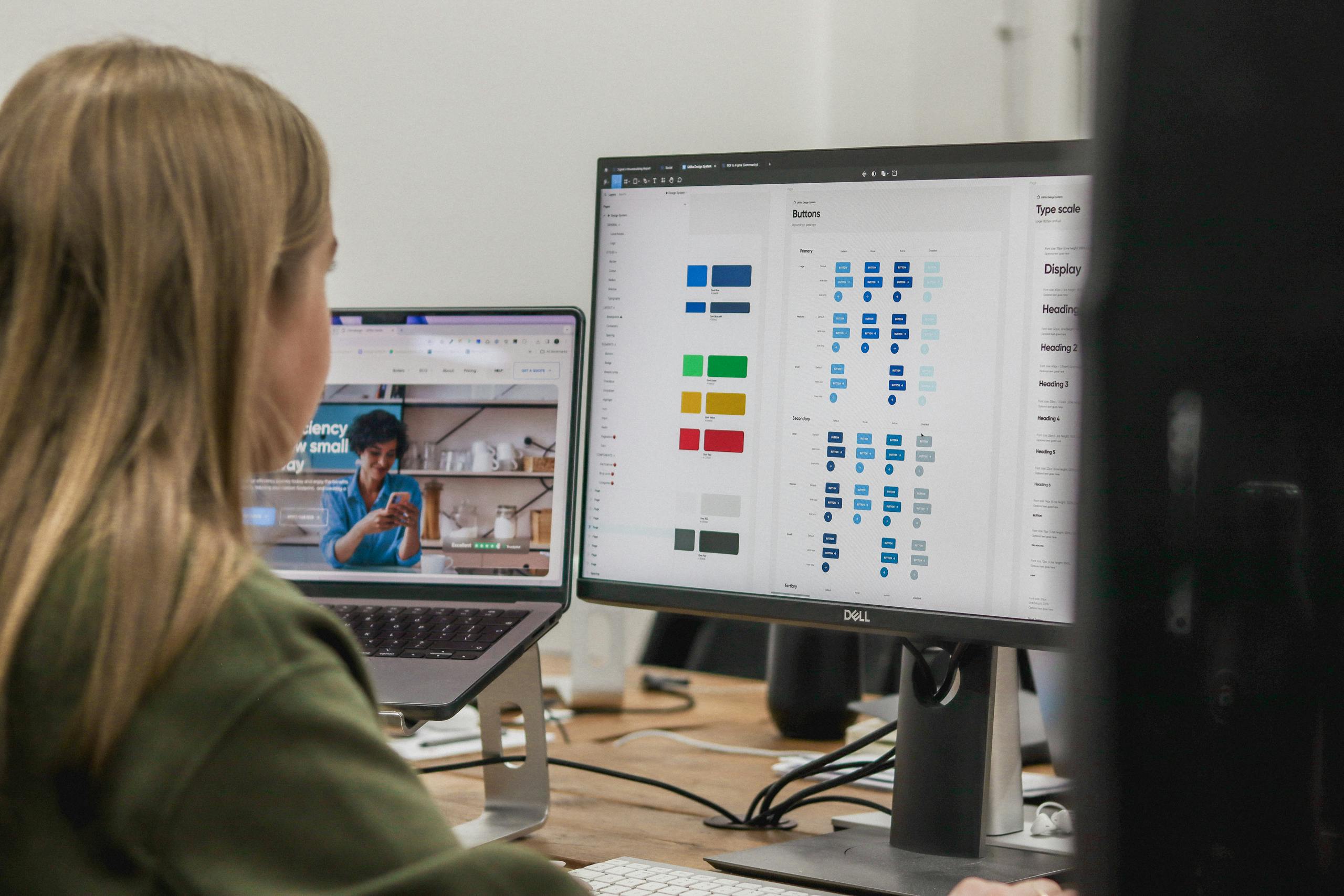
Quite a significant majority of the briefs for websites and digital products we receive mention striving for a “modern”, “clean” or “fresh” design. This is, of course, fairly subjective. What feels “modern” to you or your users can differ based on personal preference or even what industry you’re in. Obviously, there are certain design and UX trends which will help you present a more current-feeling experience to your users, but presenting an innovative brand via your digital goes beyond how you look. The tools, technologies and features that drive your experience will ultimately set you apart, as will how you approach quite basic, subtle things like interaction design and user journeys. As we’ll get to, being innovative can be as much about being restrained as it can be about going all out with flashy, shiny things.
Less is sometimes more
When it comes to showcasing innovation, it can be very tempting to try and pack in as many bells and whistles as possible. Flashy animations, loads of hi-res video, and heavily complex interactive elements can have their place in digital when trying to deliver an immersive experience. But it’s important to remember balance. Trying to shoehorn in too many can make the experience slow and clunky – impacting load speeds and overcomplicating user journeys. This will only serve to fly in the face of what you’re trying to achieve by showcasing innovation. In addition, research shows that only 30% of websites with heavy interactivity are fully accessible to disabled users. Prioritising user experience whilst incorporating more subtle interactive elements – like scroll and hover animations, transitions – can go a long way in presenting a more dynamic organisation without going too far and compromising the experience.
Approaching immersive content in the right way
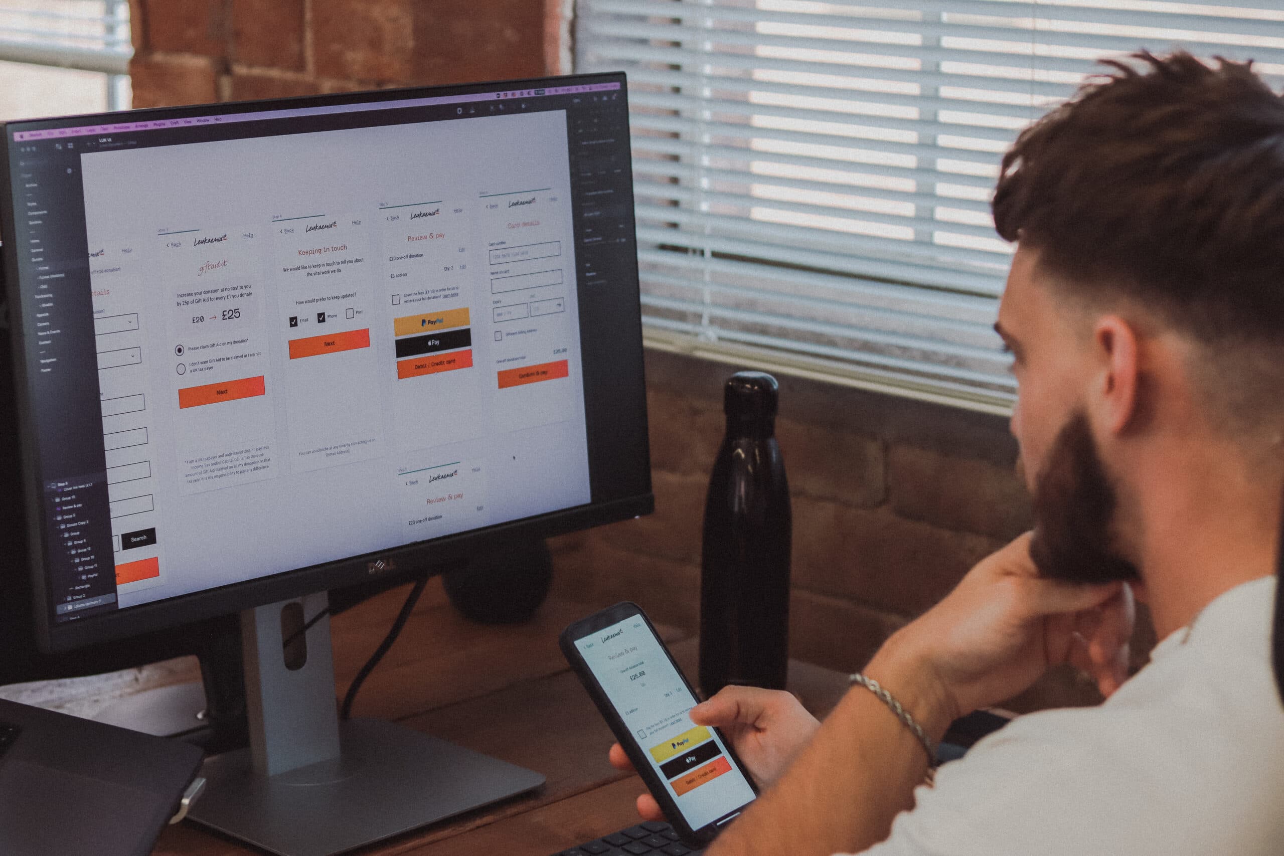
Our approach is always to build the right thing and in the right way – this means considering what the user needs to get from your digital experience and delivering this. Sometimes, that can mean more immersive content and interactivity, and in those cases, it’s important that it a) serves the wider purpose of the experience and b) doesn’t mean compromising on performance. Say you’re ordering a brand new car online – having an interactive tool where you can visualise in real-time customisations and features (e.g. paint colour, interior, etc) enhances the buying experience. However, if this is implemented in a less than ideal way, it can make for a frustrating experience. For example, Kia’s “Build your Kia” tool is quite slow and clunky. Having to scroll down to change features and then back up to view them on the 3d model is not optimal. Incorporating these highly interactive, immersive content should be done in the right way – with intuitive navigation and a behind-the-scenes infrastructure to support it. In this case, the load speed on the “build your Kia” tool might be improved if the site was headless. Headless means that the frontend (what the user interacts with) is static and separated from the backend (where the content is managed). This means that each time the user loads a page, it isn’t having to call back to the CMS to load the content, as would be the case in a “traditional” CMS setup. This greatly improves performance and load speeds.

Nailing the “basics”
As we’ve already alluded to, sometimes presenting an innovative digital experience is as much about getting the more subtle things right as it is about doing the more complex things. Nailing the basic stuff gives you a solid foundation to build from and create that innovative feel.
Mobile-first
The majority of web traffic comes from mobile – approximately 60%. This may be different for your organisation – desktop is still prominent in B2B in particular, for obvious reasons – but if a check of your web analytics tells you you’re getting most of your traffic from mobile, then it’s vital to adopt a mobile-first approach to design. Mobile-first is a way of approaching the design of a website or digital product that strips back the UX to its essential features to prioritise the experience on smaller screens.
Intuitive navigation
You want the navigation around your website or digital product to feel effortless. If it’s clunky and difficult to use, this won’t help you appear innovative. 86% of users are more likely to stay on a website if it has a clear value proposition and intuitive design. An intuitive approach to UX prioritises simplicity, minimises choice and emphasises familiarity.
Prioritising continuous improvements
Future-proofing your website or digital product will ensure you stay on top of innovation both within your sector and in the wider digital space. The best way to do this is by creating a foundation for continuous improvement. Whether that’s adopting an agile approach – where you break development down into feature-based chunks and release in stages – or securing an ongoing support and development plan, you’ll want to ensure you have the right partner and framework for iteration. If you stand still, you risk falling behind your competitors, and failing to capitalise on the groundwork you’ve done. Another benefit of having this ongoing support is that you can ensure that you’re on top of uptime and security – compromising on these aspects will damage the experience and overall perception of your organisation.
Key takeaways
- Showing that your organisation is innovative through your digital experiences goes beyond the “superficial” of design
- Sometimes, less is more – and overloading your website with immersive or interactive features that don’t add to the user experience, but hamper it, will do you more harm than good
- Nailing the basics is as important as doing more complex stuff when it comes to appearing innovative
- Prioritising continuous improvement and iteration is vital to staying innovative and staying ahead of the rest of your industry
Want to find out more about how you can use your digital experiences to showcase the innovation of your organisation? Get in touch to chat about a potential project.
Related Posts